Tag Archive for: Landing page

The Art of Landing Pages and Home Pages

If you are involved in digital marketing, you’ve often heard the terms “landing page” and “home page.” But what are they exactly? Are they interchangeable or serve distinct purposes in a successful digital marketing strategy? And how can you optimize both to drive customer engagement and conversions? Let’s dive in and explore these topics.

What is a Home Page?

The home page is the digital ‘front door’ of your business. Visitors typically see the first page when they type your business URL into their browser. Its primary purpose is to provide an overview of your business and guide visitors to other sections of your website through navigation menus.

The home page must be comprehensive and appealing, as it serves a wide range of purposes – from informing first-time visitors about your brand and offerings to providing regular updates for returning customers. It’s a general-purpose page that links to all other important areas of your site.

What is a Landing Page?

A landing page, on the other hand, is a more targeted web page crafted with a single goal or call to action (CTA) in mind. It’s where a visitor ‘lands’ after clicking a specific link from an email, advertisement, or search engine result. These pages are often used in marketing campaigns to guide visitors toward a particular action, like signing up for a newsletter, purchasing, or filling out a form.

Unlike a home page, a landing page is designed to limit the options available to visitors, removing distractions and focusing their attention on the desired action. This focused approach can significantly improve conversion rates.

The Key Differences

While both landing pages and home pages are critical parts of any website, their purposes, audiences, and structures are distinct. Here are the key differences:

  • Purpose: The home page gives an overview of your business, while a landing page is focused on a single conversion goal.
  • Audience: The home page caters to a wide audience, including new and returning visitors. In contrast, a landing page is created for a specific segment of your audience who’ve shown interest in your ads or marketing emails.
  • Structure: The home page has a navigation menu linking to various sections of your website. A landing page has minimal navigation to reduce distractions and guide visitors to the CTA.

How to Excel at Both

Here are 3 of the best practices to excel at home pages:

Clear Navigation: Your home page should be easy to navigate, with clear menus that guide visitors to important areas of your website.

Compelling Value Proposition: Showcase your unique offerings and what makes you stand out. Your home page should quickly convey who you are, what you offer, and why visitors should choose you over competitors.

Engaging Design: An aesthetically pleasing design, combined with compelling content, can create a positive first impression and increase the time visitors spend on your website

Now that we’ve talked about the home page’s best practices let’s discuss landing pages:

Focus on One Goal: Each landing page should have a clearly defined goal. Whether downloading an eBook, signing up for a webinar, or purchasing, the entire page should be crafted around this goal.

Compelling Headlines and Copy: Use persuasive headlines and copy to convey the value of your offer. The copy should be easy to understand, highlighting the benefits of your offer and why visitors should act now.

Eliminate Distractions: Remove unnecessary navigation elements and links that could distract visitors from your primary goal. The simpler the page, the higher the chances of conversion.

Wrapping Up

Both home pages and landing pages play crucial roles in your digital marketing strategy. While they serve different purposes, understanding and optimizing these differences can significantly improve your online performance.

If you’re seeking assistance with web design, home pages, and landing pages, or need a guiding hand in sculpting a winning social media strategy, look no further! Onimod Global is your ultimate destination for a plethora of digital marketing solutions.

As proud Google Partners, come and explore our services, don’t hesitate to contact us today!

5 Steps to Creating a High Converting Landing Page

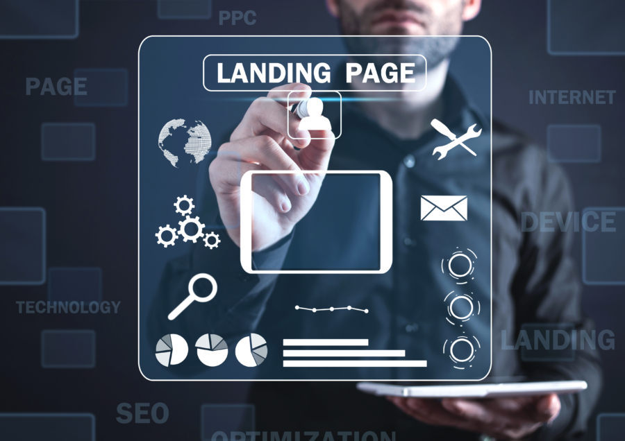
Customers arrive on a landing page through social media posts, paid advertisements, and various other content. If your landing page is ineffective, all the ad dollars and resources put towards getting these customers there was essentially a waste.

A quality landing page has the potential to increase leads, sales, and gain valuable information on potential customers. Creating highly effective landing pages can seem like a difficult task, as there’s no one-size-fits-all template, but there are a variety of landing page best practices. These combined with understanding your target audience and dedicated effort, building a high converting landing page will be much easier. 


1. Focus on Responsive, Mobile-Friendly Designs 

In 2018, 52.2 percent of all website traffic worldwide was generated through mobile phones. No matter the industry, it’s smart to make mobile design a priority. This means using: optimized images, shorter sentences, bullet points, headings, and subheadings. Mobile-optimized landing pages include a lot of white space and can be easy to read at a quick glance. Performance is also important, as conversions won’t be likely if page speed is low or chew up data. 

Mobile-optimization also forces conciseness and high design focus. Screen space can’t be wasted on extra unimportant content or fluff. The message should be focused on the action you want the customer to take. The less-is-more design approach results in a more concise and engaging final project. 


2. Have One Clear Call-To-Action 

The call-to-action is the number one, most important element that should be included on every landing page, as it’s what turns visitors into real customers. 

What should be focused on first is the text. Powerful, direct, and urgent language is key. What makes you unique and would create an emotional drive in customers? If possible try to communicate one or more of the following: they are getting something for free, they are getting something exclusive, you are solving their problem, or they have limited time to act. 

Some other elements that increase the effectiveness of call-to-actions are contrasting colors, buttons instead of links, and ensuring its visibility. Most companies and sites have a set color scheme, which is great, but you don’t want your CTA to blend in. Make it stand out by using contrasting, yet visually appealing colors. It also doesn’t need to be at the bottom of the page. It should be placed where the user’s eye naturally goes. This is something that may require A/B testing. 


3. Use Visuals 

The brain processes images 60,000 times faster than text. Meaning that visitors are immediately affected by the images on the landing page. As pictures are selected and placed, remember that they should be relevant to products and services, and high quality. 

If you’re selling a physical product, a high quality image should be displayed on the landing page. If you’re selling a service, the primary purpose of the image is to grab users’ attention and demonstrate relevance to them. 

And since the images are the first thing the user processes, you want that impression to be a good one. It has the potential to shape the visitor’s impression of your brand before they even make it to the ad copy. Which is why this isn’t a great place to use stock photos or quick photoshop jobs. Marketers have the opportunity to give potential customers a visual understanding of what they stand to gain with their product or service, and set themselves apart from the competition.


4. Have User and Search Engine Friendly Formatting 

Along with a mobile-friendly design and quality content, the page also needs to be formatted well, starting with a solid headline. It should compelling, something that will keep visitors reading. Touch on a main point that’s relevant to readers and hints that you have a solution to their problem. It’s also beneficial to use emotional power words. The most effective emotions to appeal to are anger, greed, and fear. “Stop getting ripped off!” “Free exclusive gift!” “Only 24 hours left!” are all possible headers appealing to these emotions. 

After you’ve established a heading that meets all the criteria, break the rest of the content of the landing page into segments. Each segment should have a subheading of its own that makes sense. This way if a reader is skimming the page they can skip to the section they’re looking for or read what is most relevant for them. Not only are headings and subheadings helpful for visitors, it helps search engines as well. Landing pages can be more easily indexed by Google and other search engines when they’re logically structured. 


5. Show You’re Reliable 

High converting landing pages always contain an element of trust. Include various pieces of evidence that show you can be trusted and are a reliable company, since you’re most likely asking visitors to give up some kind of sensitive information. There are five types of evidence best used to show trustworthiness.

The first is high quality landing page copy. There should be absolutely no spelling or grammatical errors. This makes visitors wary because it seems unprofessional, gives the sense that the website was thrown together, and thus unreliable. There are many tools that can help with spelling, grammar, and guides for clear landing page copy.

Proof of expertise and experience is also essential for reliability. Things such as: established in 1995, over 50,000 satisfied customers, licensed in 50 states, officially certified, member of the local Chamber of Commerce, etc, all communicate an important message. It reassures potential customers that your company is experienced, qualified, and have taken the prerequisites to earn and deserve your trust. 

Social proof, direct and indirect, is great evidence. Indirect includes social media follows, number of subscribers, likes, and shares. The more social engagement you have, the more trust you can earn. Indirect social proof can also be things like reported revenue, employee size, and other factors that bring your business clout. Direct social includes positive reviews, testimonials, and positive quotes from customers or influencers in your niche. It’s one person telling others “I had a good experience,” The simple truth is, trust begets trust.

Personal connection is next. Earn visitors trust by letting them get to know you and your business. This could be things such as a personal story, video, company bio, history, photos, etc. It helps when customers can put a name and face with who they’re doing business with. 

Lastly, evidence of security is very important. Most IT and security software vendors will give badges to their customers. You should place those on landing pages to indicate to customers that you have taken steps to ensure they’re information is protected, especially when it comes to personal or financial data. 


Contact Onimod Global 

Struggling to make your landing page convert or just need some digital marketing advice? Contact us! We are experts in all things digital marketing including SEM, Web Dev, Automation, Analytics, and much more. Learn more about what we do here, or keep up to date with all things digital marketing on our news page


5 Tips for Creating Effective Landing Pages

When seeking conversions of any sort, a landing page can “make or break” a user’s decision to convert. Building a compelling landing page tailored for conversions is much easier said than done. There are numerous factors that go into the creation of a landing page, but what separates good landing pages apart from bad ones? This post will explore five effective landing page practices from our previous experiences thus far at Onimod Global.

1. Use a Landing Page Template:
In today’s digital world, setting up a landing page from scratch may already put you at a disadvantage. There are many online resources out there that provide user friendly templates to get you started on the right path. Some that come to mind are Instapage, Leadpages, Unbounce, and certain WordPress plugins. Most landing pages that you’ll come across today are most likely created from a template.

2. Emphasis on Call to Action:
Having a clear call to action is one of the most important features for any landing page. The call to action is essentially what you want website visitors to do. Some highly used call to action phrases include: buy now, register, more info, sign up, contact us, etc. It’s also important to not distract site visitors with lots of other requests on the page. There should typically be only one, clear cut call to action. Ultimately, the call to action is by far the most important aspect of any landing page.

3. A/B Testing:
A/B testing is one of the most efficient strategies when it comes to finalizing a landing page. A/B testing consists of tweaking certain characteristics to test one landing page layout against another. Characteristics that can be tested include text font, color, size of buttons, navigation features, subheadings, use of bullet points, and any other web page feature you desire. The overall purpose of A/B testing is to ensure that your landing page is user friendly with main points and the call to action being “eye catching.”

4. Precise Information:
The last thing you want to do with any landing page is ramble on with information and drive potential conversions away. Over time research has indicated that the more choices you offer people, the less chance you have of getting desired conversions. A couple of questions to ask yourself when constructing a landing page are “do I really need to gather every piece of information possible?” or “is it relevant to include every piece of company information?” Keeping forms short and simple will most likely increase your response rates and moving all company info to the “about” page is probably your best bet.

5. Show Off Credibility:
It’s no surprise that consumers tend to place a higher value on products/services that other people have already approved. Showing off statistics, testimonials, or mentions from the media is an effective way to display an organization’s credibility. Great testimonials in particular should always be showcased somewhere on the landing page. Word of mouth is a powerful thing, whether it comes in the form of testimonials or even likes and shares.

Contact Us: For more information regarding digital marketing expertise, visit the Onimod Global Website. We provide weekly news updates on the latest in the world of digital marketing. Enjoy!

The 7 Best Ad and Landing Page Elements to Boost Online Conversions

When it comes to success with paid search, it’s not just about ad copy. You have to pay attention to your ad extensions and your landing pages as well.

In this article, Mona Elesseily from Search Engine Land discusses the specific ad features and page elements that searchers/shoppers want when they’re shopping online. She also covers ways to also incorporate the elements using PPC/paid search.

1. Images

Seventy-eight percent of shoppers want images.

Shoppers respond well to images. It’s the reason Google has been and is continuing to increase the number of images we see on search engine results pages (SERPs). It’s also the reason good online retailers allow us to zoom in and view products from different angles.

An awesome way to increase the number of images in the SERPs is to use product listing ads (if applicable). We love how product ads allow us to take up space and show more than one product in the shopping pack. We like adding ad annotations like price drop alerts (in Bing), merchant badges and product ratings to make ads pop even more and grab buyer attention.

Focusing on feeds now will pay dividends in the future, as shopping feeds will likely appear in more places in the SERPs (Think image search and local ad units), and feed-based advertising will become much more commonplace. It’s a good idea to prep for opportunities that will come along in the not-too-distant future.

2. Product reviews

Sixty-nine percent of shoppers want product reviews.

It’s a great idea to have them on your site and also to incorporate them into PPC ads using review extensions. Review extensions are finicky, as there are lots of search engine policies related to posting “accurate and current” reviews. It’s not uncommon to have ads disapproved a few times before they get approved.

It’s worth noting that reviews can be no more than 12 months old to appear in Google Trusted Stores, and hence, review extensions. Consistently ask customers to review products, so that review extensions (and seller ratings, for that matter) will continue to appear in your account.

3. Side-by-side product comparisons

Forty-six percent of shoppers want side-by-side product comparisons.

These are effective ways to compare your company products or to compare your product against the products of competitors. Graph or table format tends to be the easiest to read and allows shoppers to better digest information.

Here’s an example from Phillips and some of their natural light wake-up lights:

http://searchengineland.com/figz/wp-content/seloads/2016/10/Screen-Shot-2016-10-02-at-11.34.27-PM-800x472.png

Personally, I like to highlight (or badge) the most popular product. Badging is very effective in improving online conversions, and I’ve seen increases of more than 20 percent when tables include a badge. In the example below, the pro version of the product is the most popular and is denoted using the color blue.

http://searchengineland.com/figz/wp-content/seloads/2016/10/Screen-Shot-2016-10-02-at-11.39.19-PM-800x378.png

This example would have been even better if the blue column were marked “best seller” (or similar wording).

4. Customer testimonials

Forty-two percent of shoppers want customer testimonials.

I find these very useful, especially if there’s a striking difference between you and your competitors.

I work with a company that manufactures a product that’s more expensive than their competitor’s product. Their testimonials highlight other benefits and do an effective job of making the extra cost negligible. The “negative” is offset by the awesome knowledge and customer service.

screen-shot-2016-10-03-at-12-07-27-am

Testimonials effectively encourage people to bite the bullet because they know their overall experience will be good and that they’ll be thrilled with their purchase.

5. Video product demos

Thirty percent of shoppers want video product demos.

This is especially true if the product is complicated or hard to understand. For example, let’s say you sell car replacement parts, and the parts are tricky to install. Here’s an example of videos from 1aauto.com.

screen-shot-2016-10-03-at-12-17-30-am

In PPC, video extensions are a good option to consider. At this point, these are only available in Bing.

6. Live chat with shopping assistant

Twenty-two percent of shoppers want live chat with a shopping assistant.

A good option for this is the ActionLink extension in Bing. We’ve seen higher ad engagement as a result of including this, especially in industries where people have a lot of questions, like home renovations.

7. Links to media coverage of company products

Nine percent of shoppers want links to media coverage of company products.

On sites, people often include “as seen on” and other such credibility indicators. Be sure to also include links to media coverage. I test short video clips of the media coverage on pages. Sometimes, having clips in addition to links to media coverage boosts conversions.